In the realm of web design, every pixel matters. From the layout to the typography, every element plays a crucial role in shaping the user experience.
In this article, we'll explore the role of color psychology in web design and how it can be leveraged to create captivating online experiences.
Color psychology is the study of how different colors can affect human emotions and behaviors. While individual perceptions of color can vary based on cultural, personal, and contextual factors, certain general principles tend to hold true across various demographics.
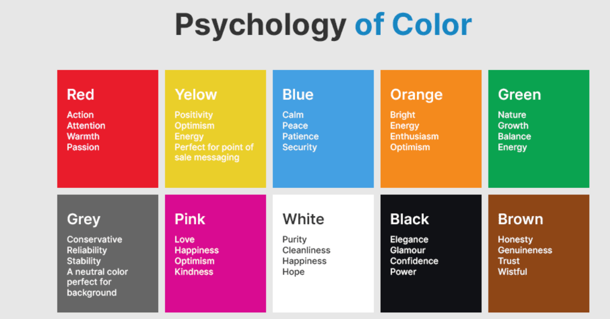
Associated with energy, passion, and urgency, red can stimulate appetite and create a sense of urgency. It's often used for calls to action (CTAs) to encourage users to take immediate action.
Symbolizing trust, stability, and calmness, blue is frequently used by brands to convey reliability and professionalism. It's a popular choice for corporate websites and digital marketing platforms.
Radiating warmth, optimism, and friendliness, yellow can grab attention and convey a sense of cheerfulness. It's often used to highlight important information or create a welcoming atmosphere in graphic design projects.
Linked to nature, growth, and health, green is associated with harmony and balance. It's commonly used for environmental initiatives, wellness websites, and brands promoting sustainability. For interactive web solutions, check out our web development services.
Signifying luxury, creativity, and spirituality, purple is often used to evoke a sense of sophistication and uniqueness. It can be effective for brands targeting a niche audience or offering high-end products/services.
Combining the energy of red and the warmth of yellow, orange is attention-grabbing and exudes enthusiasm. It's often used to create a sense of excitement and encourage impulse buying.
While the emotional connotations of colors are essential, it's equally crucial to consider how users perceive color combinations within the context of a website. Factors such as contrast, saturation, and cultural associations can significantly impact how colors are interpreted.
High contrast between text and background colors enhances readability and ensures essential information stands out. Designers should consider accessibility guidelines to accommodate users with visual impairments.
The intensity of color can evoke different emotional responses. Bold, saturated colors can create a sense of vibrancy and excitement, while muted tones may convey sophistication or tranquility.
Colors can carry different meanings and symbolism across cultures. Designers should be mindful of cultural sensitivities and preferences when selecting color palettes for global audiences.
When incorporating color psychology into web design, it's essential to strike a balance between aesthetics and functionality. Here are some practical tips for leveraging color psychology effectively:
Choose colors that align with the brand's identity and values. Consider how different color combinations can evoke the desired emotional response from the target audience. Our job-oriented courses help designers apply these concepts professionally.
Use color to guide users' attention and emphasize key elements such as CTAs, headlines, and navigation menus. Employ contrasting colors strategically to create visual hierarchy and improve user flow. For advanced strategies, explore our SEO training.
Conduct A/B testing to evaluate the effectiveness of color schemes and make data-driven decisions. Monitor user engagement metrics to determine which color combinations resonate best with the target audience.
Maintain consistency in color usage across different pages and devices to reinforce brand recognition and ensure a cohesive user experience. Use style guides to document color palettes and guidelines for future reference. Consider attending our workshops to gain hands-on experience.
If you are looking for other courses checkout here - Internship | Web Design & Development | Python Programming